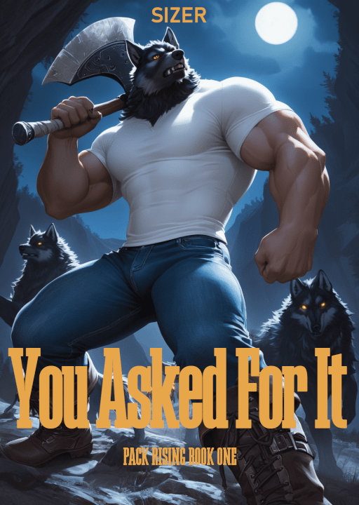
Better, but no. For some reason, that feels Western.
I hate this process. It’s so tedious and aesthetically gratuitous.
That’s Megalito-Slab-Extra-Condensed, which is supposed a “free” font similar to ENBOK Regular. It’s not free. It’s free to download, but if you use it for anything, you need the commercial license.
Even a lot of “free downloads” are not free. You must create an account. No. I won’t remember the password and I don’t want all your spam emails.
Playfair Display SC – Semi-Bold
It’s got to be a “condensed” font. The serifs seem OK. I’m not thrilled with “lowercase is just shorter uppercase”, but I can live with it. I like the weight ratio, whatever that’s called. The aspect ratio is definitely wrong.
I suppose this is progress: Serif and Condensed are requirements, not observations.
