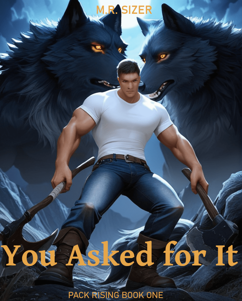
That cover is an example of illustrating the book. I really like it, even now. However, it falls into that cartoon-ish category I want to avoid. Tom and Luke don’t partially shift, at least not yet, so the guy with the werewolf head is not a thing.
Digression: That’s a font problem. What the heck is “Ill”? It’s the “AI” vs “Al” problem. Yes, those are two different words. One is Artificial Intelligence. The other is Allen. I’ve always been fairly neutral in the serif wars, but I think I may be coming around to the serif side. Update: In the published font, the lower-case “l” has a little serif on the bottom. That does not exist in the editing font.
That cover doesn’t represent the book. I still like it, but the cartoonish guy sends the wrong message, entirely.
I just re-read 1632 to see how Mr. Flint handled the group dynamics. (If you haven’t read it, give it a try; one of the very few trad-published books I will recommend buying. If you like it, the series is long.) It’s been a long time since I’ve read them and I have most of them. Which one is next? Well, there are options, from the author, no less. Then I read the preface to “the next one”. It’s worth reading just for the sheer ambition of it, but this is the part I want to highlight (emphasis in the original):
History is complicated. It is not the story of a few people, it is the story of an immense number of people—each of them full individuals in their own right, each of them having their own greater or lesser impact on developments.
In the nature of things, fictional series—like biographies—tend to give the illusion that history marches more-or-less in lockstep with the actions of the main characters of the story. That’s almost inevitable, given the very nature of narrative. But it is an illusion, and I wanted to avoid it as much as possible in the unfolding 1632 series.
Flint, Eric. Ring of Fire (Ring of Fire anthologies Book 1) (p. 7). Baen Books. Kindle Edition.
I’m not writing alt-history (ever – my knowledge of history is severely lacking). But I am writing alt-future. The same concept applies. I am not of Eric Flint’s stature. There is no way book TWO will be an anthology by other well-known authors. However, the same concept applies and I’ve already alluded to it in Chapter 1 (yay, me).
I’m ambiguous about “one’s reach should exceed one’s grasp”. On the one hand, yes; stretch goals are a good thing. On the other, no; aim for what you know can be accomplished. Writing a book at all is a stretch goal for me. Aiming for something like 1632? It’s insane (even leaving aside genre and gay werewolves). That doesn’t mean I can’t learn something from it.
Fire From the Sky is more what I’m aiming for (darn; looking up the link, there isn’t a new one, yet). It’s got the same sort of scope, but the focus is much, much tighter.
This is not a wandering digression from the post title. This is why “cartoonish” doesn’t work, even if if it’s illustrative. Underneath the LitRPG, gay, and werewolf stuff, I’m wondering “how does one deal with this sort of change?” Where “one” is lots and lots of different people, each with their own ideas and ideals.
The good LitRPG books address this issue. It’s why I don’t like the Cultivator sub-genre: I don’t like how that milieu addresses it (might makes right, now get out of my way, peasant).
I finally grew a brain and I’m having the AI generate pictures in the right resolution and aspect ratio. That is, covers are not square and 512×512 is far too small. Pumping out another 1000. About 1 in 100 is worth considering. The one on this post is one of the new ones. ETA: 67 HOURS. My computer has never been this busy – good thing I’ve got lots (and lots) of oomph. I can’t even tell it’s doing anything, other than the fan noise.
Parenthetical: I didn’t like how these (overly) big, muscular guys had flat crotches. I added “dick bulge” to the prompt. Oh my. Is that a soccer ball in your pants or are you just happy to see me? Adding “small” didn’t help. Adding “big dick” to the negative prompt didn’t help. Using my secret decoder ring (aka the Intertubes), adding brackets, “[dick bulge]”, pretty much negated the text. Oh well. Representing, not illustrating.
Parenthetical, paragraph two: If you (and you’re a man) could control your body, especially if it were mostly subconscious, don’t try to tell me “bigger dick” wouldn’t be on the list. A common LitRPG trope is that going up a grade changes one’s appearance toward the person’s ideal. Our intrepid werewolves are tapping into that via the Shift skill. Their human forms are changing to be more what they want themselves to be. Not only are they men, they’re gay men. Big dick is definitely on the table (and will go horribly awry at some point). Doesn’t need to be on the cover, though.
1 in 100? Yes. Stable Diffusion is known to have issues with multiple foreground figures. There are various work-arounds, most of which are designed for people. I tried a few and they broke the Furry model. Stuff like this pops out, regularly.
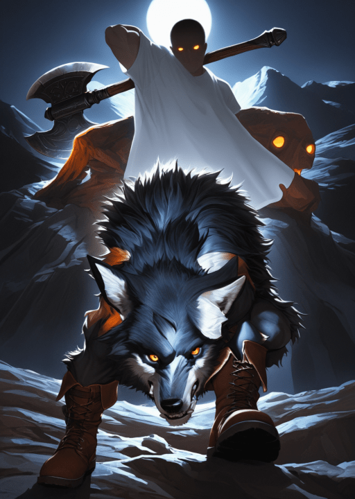
Then there are the more subtly bad ones:
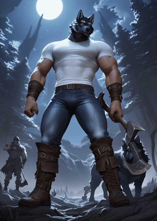
The axe obscures the wolf. Otherwise, that would be a contender (and get rejected for lack of color). And note that he does have a dick bulge.
