Over lunch, I was on Amazon for another reason. As usual, I was presented with a “You Might Like This” list. I print-screened four sets of four covers. In each set, I put my tentative cover over one that I didn’t want to be grouped with.
I definitely need a different title font. The book font at least needs to be heavier. The author at least needs to be bigger.
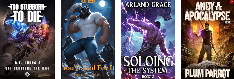
Needs more glowing stuff to fit in there, but I’m OK with it.
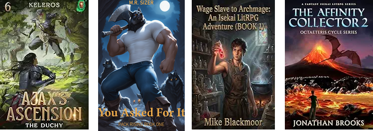
It stands out, but not in a bad way, I don’t think.
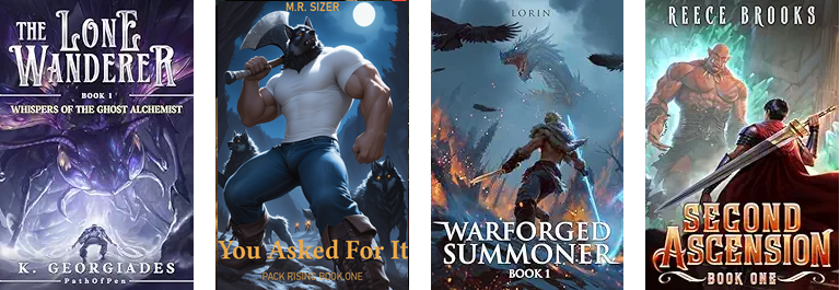
It looks plain in that set. There isn’t really anything glowy in the book, at least not yet. Something may turn up; I’m only halfway.
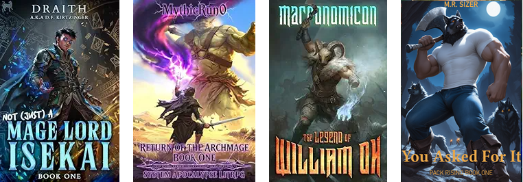
Again with the lack of glowing things.
Data analysis says “add glowing things”. I’m resisting because there are no glowing things. “Illustration” is pulling at me, again. In my defense, I think it’s also a “representation” issue if there are no glowing things in the book. Book two will have glowing things and I’ll happily put them on the cover.
I will definitely address the font issues.
- Author. If I ditch “M.R.”, “SIZER” can be much larger and still fit over the werewolf’s head.
- Series. It just needs to be heavier. I’ll make a font decision after fixing the title.
- Title. I can see it, but I can’t describe it. I don’t think “pointier” is a word. Heavier and larger, too. I may need to come up with a new title. “You Asked For It” doesn’t split into two lines. “An Eternal Moment” comes to mind.
A problem for later, but definitely a problem.
Update: The first Cover Style post.

