This is only limitedly negotiable. Genres have cover styles, which change over time. If one violates that style, one irritates readers because they don’t get what they expect.
This is why “shirtless guys” sends the wrong message. I’m not writing a Gay Romance novel. There is a gay romance, but that’s not the same thing.
The problem: I suck at style. I’m an “I know it when I see it” kind of guy. Generating it is an entirely different kettle of fish.
Let’s take a look, shall we? I’m hoping that both “fair use” and “links” will absolve me of any copyright sins. By and large, these are 50% scaled images.
I can cross this off the list from the start:
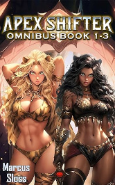
I could do a cover in that style and it wouldn’t even be wildly wrong, but that’s not the message I want to send.
Cartoonish is another one I can cross off my list. I don’t care for it and I certainly cannot create it.
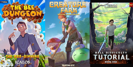
That doesn’t necessarily mean they are light-hearted. Hell Difficulty Tutorial is quite dark, which I think is bad signaling. But I must admit the cover is not as “fluffy” as The Bee Dungeon or Creature Farm (neither of which I’ve read).
These are both light-hearted – and quite good:
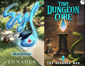
I would expect the covers to be much more similar. Syl is the one about the slime that grows to sentience. Tiny Dungeon Core is cute, yet seriously written. It’s about a, well, tiny dungeon. The monsters are mice and snakes. Very appropriate cover.
Even if it were appropriate, which it’s not, I would never even attempt the font work of the Syl cover.
This is the sort of thing that I’m thinking about:
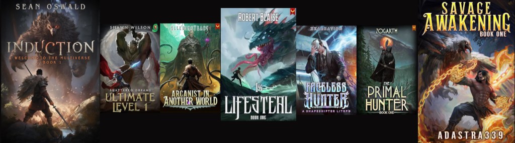
Oddly enough, the big ones are the ones reduced to 25% of their original size. In any case, what do we have here?
Weapons. Everyone other than Faceless Hunter (which I haven’t read, but I chose it because it’s a shapeshifter one) has a weapon. He has that mask, which I assume is what allows him to shapeshift; it’s sort-of a weapon.
Something that glows. For 1% Lifesteal, it’s the water that’s glowing, but something is glowing.
Monsters. Induction, Ultimate Level 1, 1% Lifesteal and Savage Awakening have big, scary monsters. The eye of Primal Hunter‘s monster is the moon; I guess that’s big and scary, too. Arcanist in Another World‘s monster is the most human-looking. Faceless Hunter has none.
Color. Even if it’s not bright, they all have color.
Not photo-realistic. The images are (“ish” at least), but the backgrounds are clearly not.
Weapons are easy: Tom has a maul. Luke dual-wields hatchets. Werewolf eyes could work for the “something that glows”. A werewolf can be the monster. I’m not sure what to do about color.
An important tip that I have read many times (not the least at Mad Genius Club) is that the cover does not need to be, and often should not be, a scene from the book. It needs to represent the book, not illustrate the book.
That means: Tom and Luke can be on the cover with a werewolf, even if they are the werewolves. Their weapons can glow, even though they’re not actually magical. Etc…
Instead of
two muscular men in jeans and tight white t-shirt full body hiking boots visible standing close outside dry hills background with a wolf sitting beside them
something more like
a muscular man in jeans and tight white t-shirt with a maul full body hiking boots visible standing close to a werewolf outside dry hills background bright moonlight
Let’s see what that does… Nothing good. Apparently “werewolf” cancels out “white t-shirt” because there are a lot of shirtless men in this set. It also doesn’t know what a “maul” is, which is fair enough because Tom thinks he’s carrying an axe.
I added “full body” because it kept creating tight shots that cutoff at the thigh. Reading that, I’m surprised it hasn’t generated someone encased in an hiking boot.
Let’s see if it can even do a werewolf alone. Not bad, although the lack of genitalia on the full frontal humanoid werewolves is a bit disconcerting. Some of them have glowing nipples, which fits the “something glowing” pattern, but no. The style is definitely less photo-realistic, too.
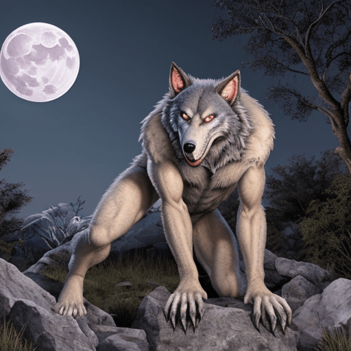
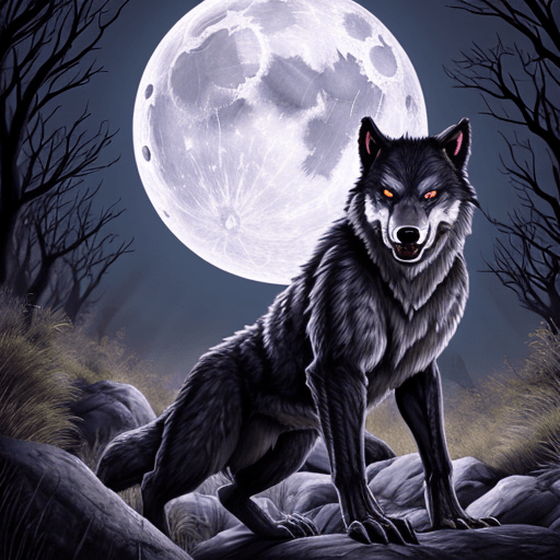
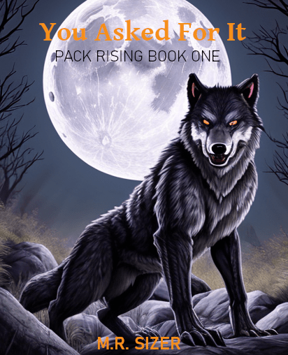
Those are two of the better ones. I rather like the latter (something is wrong with legs in the former), but it is not very “werewolf” more just “wolf”. The lighting is all wrong, but I can live with that.
I’ll keep trying, but progress, I think.
So I don’t forget, the “featured image” fonts are Gentium Book Basic Bold for the title; Bahnscrift Semi-Bold for my name; Bahnschrift Light for the series.
It’s not awful, but definitely not what I’m going with.

One thought on “Cover Style”