Despite my tendency to end chapters with everyone going to bed, there are times when one needs a time break or perspective switch within a chapter.
Exactly what marks this break varies widely. A blank line/empty paragraph is a bit subtle. A centered horizontal line about a quarter the width of the page is traditional, I think.
Of course it has gotten more extravagant in the computer age. There’s all sorts of stuff out there. I thought to myself, I thought, “a wolf print would work nicely”.
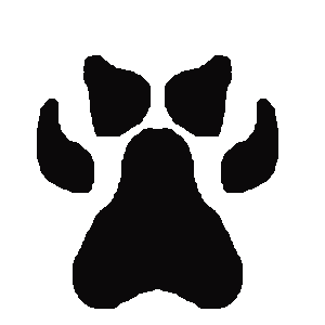
I did an image search. EVERYTHING requires a license (“royalty free” only applies if it doesn’t leave your computer). It’s a blob with four splotches in front of it; some of them have claws. I’m willing to pay for art, even clipart, if it’s something, well, artistic. A wolf paw print is not artistic. It’s even symmetric. One only needs to draw half of it.
The first challenge: What the heck are all these brushes?
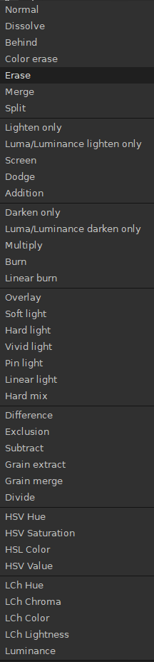
“Normal” seems good, right?
Paw01.png. Yes, it’s horrible. It also took two minutes to draw.
Iterative development is a thing.
- Pull the middle third out of the paw to make it shorter and wider.
- Make the outer toes wider and lose some of the teardrop shape.
- Make the front toes more forward facing and longer.
Why is nothing ever easy?
I think I need a beer now. I’m health-conscious: I’ll walk to the liquor store to get it.

Update: That’s not too bad – and it’s still about 50% too big. I think claws. Maybe rotate it sideways and add slash marks, but that’s the sort of thing that starts to get into “art”; making lines look ‘slashy’ is not as simple as five splotches. And I’m not even done with my first beer, yet.

One thought on “Intra-Chapter Breaks”