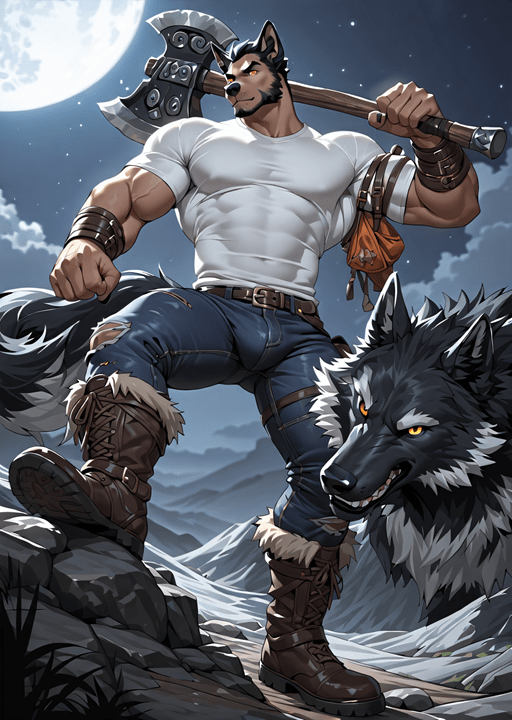
See, always a “two”. All 1,200 of them fail. Until they run out, I’ll use some of the vaguely acceptable ones as featured images for the LitRPG Werewolves category. That one has too much dick bulge, which is very common in this set, and lacks color and/or glowy things. The plastic look doesn’t really showContinue reading “Lunchtime Cover Disappointment 2”
Category Archives: Writing
Lunchtime Cover Disappointment
I forgot to write something down about the stable diffusion settings. This round is different. Not necessarily horrible, but, well, mostly horrible. I’m getting ridiculously bulging cartoons. For example: Something kind-of like that would actually work. It meets all the criteria (except having room for the text). It’s more abstract than I have in mind,Continue reading “Lunchtime Cover Disappointment”
I Cannot Tell
The weekend goal is to make progress on the outline. After writing it, I decided that I’d rather passively watch something than actively write. Since it’s only Friday night, that shouldn’t impact a weekend goal very much, right? I cannot tell if this is AI or not: It’s good. I’ll even go so far asContinue reading “I Cannot Tell”
Attack Miniphany!
I got it! The biker gang does not attack Kier, itself, which is idiotic. They attack an outlying farm. I have already established that at least some of these farms have radios to talk to the sheriff. From chapter 13: “Nice to meet you, sheriff. I’ve got to ask, do you often stand on theContinue reading “Attack Miniphany!”
Plasma Spheres
Summary: A cubic inch sphere of oxygen plasma contains 10 kJ of energy. That makes a 12 cubic inch (~3 inch diameter) sphere hand grenade equivalent. How I got there: The original plan for the firepit (the scene that refuses to be written in chapter 19, in case you are just tuning in) was toContinue reading “Plasma Spheres”
The Townsfolk
If I’m going to give them agency, I need to know who they are. The real-world Kier has a (Wiki) population of 350. I’ve written “under 500”. That’s a lot of people. Some of them must be good for something (apparently, I’ve become a Utilitarian in my old age). Who we have so far, inContinue reading “The Townsfolk”
Arced
I’ve retroactively added arcs for the first half and proactively added them to the second. What’s Going On? covers chapters 1, 2, 3, and 4.Getting Used to It covers chapters 5, 6, and 7.Lone Wolves, Numbers Go Up covers chapters 8 and 9Introductions covers chapters 10, 11, 12, and 13.The Cost of Power covers chaptersContinue reading “Arced”
Specific and Particular
I’ve been listening to some AI things (stories? podcast? audio short stories?) and I’ve noticed something very strange: They use the words “specific” and “particular” a lot. They’re not used incorrectly, just so often. What makes that strange is that these AIs are trained on our data. We don’t use those words so frequently. WhyContinue reading “Specific and Particular”
My Competition – Two
Another “two” post. Unlike the first one, this one isn’t awful. The cover image is a link. Note that the cover checks all the boxes: Weapons, Something that Glows, Monsters, Color, Not Photo-Realistic, and Serif font (sort of). (The lighting is wrong; there’s another light source about four feet above and ten feet forward ofContinue reading “My Competition – Two”
Feedback Two
I should just start out numbering all posts. I always seem to write at least a second one. Anyway… The back and forth between Luke and Tom, especially at the start of the book seems… off? I can’t describe it. It doesn’t flow well. Oddly the conversations Luke has with other people are better. IContinue reading “Feedback Two”

